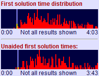
Solution time distribution graphs
I was tidying my desk earlier when I suddenly thought: wouldn’t it be fun to see exactly how your puzzle solving time compared with every other solver?!
And so now you can. If you play puzzles online at PuzzleMix then the statistics show a distribution of solution times, highlighting where you fitted:
 My result is the yellow/pale blue bar, and as you can see I was the second or third fastest on this particular puzzle. Previously all I’d have known is that I was better than average, and near the fastest. Now I can see just exactly where I fit in.
I think this is great! ![]() Of course, it’s a bit embarrassing when your highlight bar is off to the right, or doesn’t even fit on… (it only shows the top 90% of results when there are 20 or more, and omits all results longer than 2 hours).
Of course, it’s a bit embarrassing when your highlight bar is off to the right, or doesn’t even fit on… (it only shows the top 90% of results when there are 20 or more, and omits all results longer than 2 hours).
Comments are closed.

Recent Comments